Church Bulletin Design 101: Tips, Templates, and More


In the words of the late Mitch Hedberg...
That's because most flyers are boring, poorly designed, and don't offer value to the recipient.
What if we could rethink our church bulletins so that more people actually read them instead of tossing them in the nearest trashcan?
I'll cover the anatomy of good church bulletin design, along with some templates and tips to help your bulletin avoid the dreaded trash can!
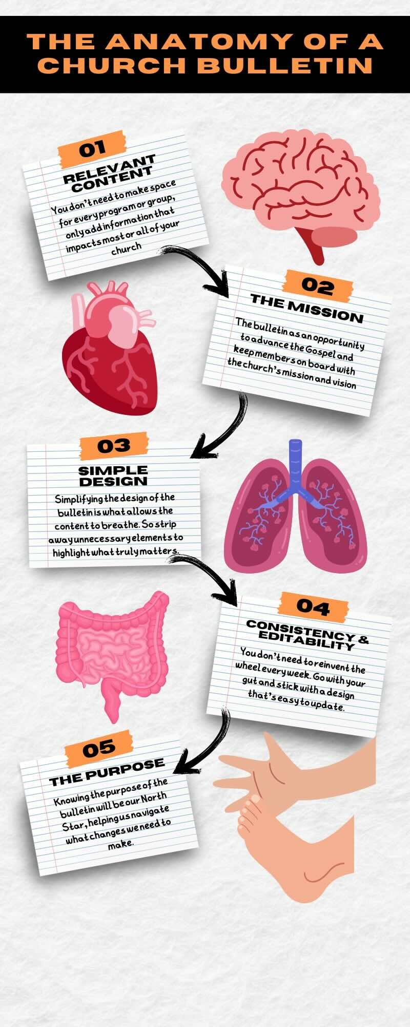
The Brain - Relevant Content
A lot of thought should go into what content to feature in the bulletin.
I've been handed bulletins with a whole page dedicated to upcoming events for every program, ministry, and group tied to the church. That meant I had to sift through content irrelevant to me to find one nugget of info I needed.
You don't need to make space for every program or group. The people tied to that program should be getting their info from the program leaders, not the bulletin.
Only add an announcement that impacts most or all of your church. That way, the most important information takes center stage.
Less is More
The less info you include, the better.
Identify the most critical information for each week and feature it prominently. Avoid overcrowding the bulletin, using concise and impactful messaging.
Remember, less is often more when keeping your congregation engaged and informed.
The Heart - Advancing the Mission
Your church's mission and vision statements are the heartbeat of the church. The brochure needs to reflect that.
Most churches see the bulletin as a matter of business. They use it to share what's going on at the church and that's it.
A Missed Opportunity
Those churches overlook the bulletin as an opportunity to advance the Gospel and keep members on board with the church's main goals.
Every element, from the layout to the content, should move your church toward seeing your vision fulfilled.
If the bulletin doesn't advance the mission and vision of the church, then it's a waste of time and money.

The Lungs - Simple Design Elements
Simplifying the design of the bulletin is what allows the content to breathe.
I've been to a lot of churches and I've seen some real church bulletin doozies. Bulletins with almost a dozen different fonts, and a dizzying array of colors, and random clip art everywhere.
Those Microsoft Word clip art images have served the church well, but it's time to lay them to rest! You don't want your bulletin looking like this...
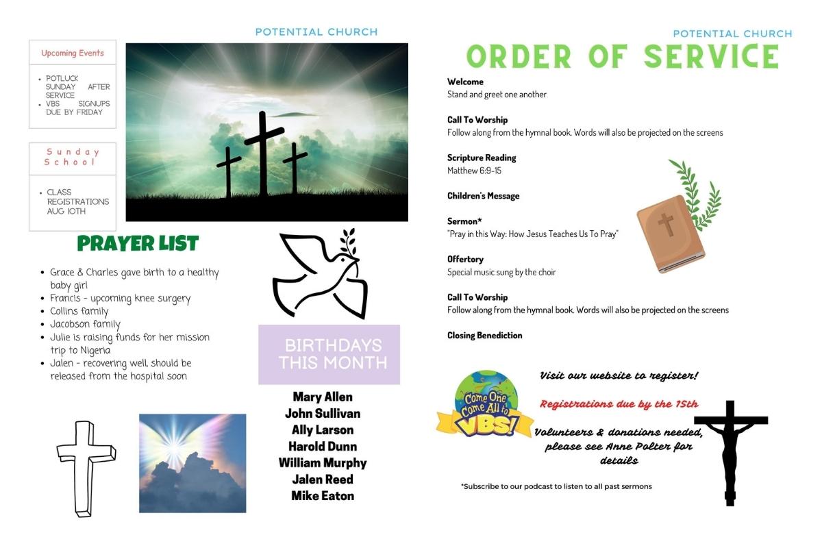
In fact, if it looks anything like that, it's definitely time for a change! This is when good church bulletins go bad.
The Gut - Consistency and Editability
You don't need to reinvent the wheel every week. Go with your gut and stick with a design that's easy to update.
Not only does consistency make your work easier, but it helps readers to know what to expect. They'll know where to look for the info they need without feeling overwhelmed.
Choosing one of the templates linked above will make a huge difference, especially since Canva makes it so easy to edit designs.
The Hands & Feet - The Purpose of Your Church Bulletin
This is where the rubber meets the road. Before we make any changes, we have to ask a few important questions.
- Why does your church have a bulletin?
- What is the purpose or goal of the bulletin?
- Is the information in the bulletin necessary or relevant?
- If a guest were to read the bulletin, could they make sense of it?
Knowing the purpose of the bulletin will be our North Star, helping us navigate what changes we need to make.
Free Church Bulletin Templates
We recommend using Canva for creating church bulletins. It's easy to use, has many great free bulletin templates, and the Pro subscription is free for nonprofits.
We have created a template you can use, but Canva has many more.

Bulletin Design Pro Tips
- Embrace whitespace to create a clean and uncluttered layout
- Choose modern fonts that are both visually appealing and easy to read. And don't use more than three different fonts. If your church already has a font package, use those fonts for consistent branding
- Limit your color palette to maintain a cohesive look and prevent visual overwhelm. Again, if your church has a color pallet, use those colors for consistency
- Use the design principles of visual hierarchy to guide readers' attention to the most important information, using bold typography and strategic placement of elements
Remember, simplicity doesn't mean sacrificing style; it means stripping away unnecessary elements to highlight what truly matters.
Create the Best Church Bulletin
The best church bulletin advances your church's mission, is easy to use, and that members actually read!
By using the templates linked above and focusing on relevant content, you can make your church bulletin better serve your church...and NOT fill up a trash can!